Unfortunately, negative percentages aren't valid in CSS, so you can't use percentages for the width of the sidebar, since we use a negative margin to position the sidebars. I don't see why you would need to change the values after setting it up once anyways.
It isn't
that difficult to figure out. First of all you should know the CSS box model (ignore the Internet Explorer 'width' for now):
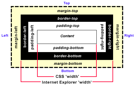
(image borrowed from microsoft)
The main thing to understand is that to calculate the total width something is going to take, you just add up the margin-left + border-left + padding-left + width + padding-right + border-right + margin-right.
The next thing to understand is how the sidebars are laid out. The basics of this is that to create a right sidebar, you put a right border on #ocwrapper, then with a negative right margin on #rightsidebar, you move #rightsidebar outside of #ocwrapper into the border area (if you look at the html structure of it, #rightsidebar is contained within #ocwrapper). You can see
this tutorial for more detailed information.
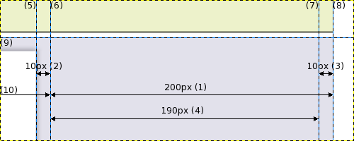
Here's an image that shows how the right sidebar area is laid out by default (zoomed 2x):
To explain the image I'm going to have to paste the relevant CSS from luna_core.css:
Code:
#ocwrapper {
border-right: 200px solid #e2e1eb;
background: #e2e1eb;
}
#rightsidebar {
margin-right: -200px;
padding: 10px 10px 10px 0px;
width: 190px;
}
First of all, we have (1), the 200px border of #ocwrapper (it goes from (6) to (8). On top of that, we've used the negative margin to move #rightsidebar so that the right side of it sits on the right side of the border (8). To make #rightsidebar fit in that area, we could just give it a 200px width, but we want to pad it so text doesn't get too close to the edge. The left side of #rightsidebar doesn't need it because the shadow already provides a 10px padding ((2) - from (5) to (6)). So we just pad the top, bottom, and right (3) of #rightsidebar. That's why we have (remember, with shortcut CSS, it's top, right, bottom, left):
Code:
padding: 10px 10px 10px 0px
So to calculate the width (not total width) of #rightsidebar is just:
200px (the width we want #rightsidebar to fit in) - 10px (padding-right of #rightsidebar) = 190px
Here's another quick example. Say you want #rightsidebar to take up 300px (total width) and also have a 30px padding. Then your CSS would be:
Code:
#ocwrapper {
border-right-width: 300px;
}
#rightsidebar {
margin-right: -300px;
padding-left: 20px;
padding-right: 30px;
width: 250px;
}
#contentheader .error, #contentheader .message {
margin: 0px 300px 0px 0px;
}
With the calculations of the width being:
300px - 30px (padding-right) - 20px (padding-left: remember the shadow gives you a 10px padding) = 250px
That wasn't too hard to understand was it?

Adrian

